
Helloself
Freelance UX/UI Designer & Researcher

THE CLIENT
Helloself is a small business committed to providing high quality online therapy and coaching, empowering individuals to be their ‘best selves’.
THE BRIEF & CHALLENGE
Designing an initial prototype to pitch to investors with the aim of showcasing the concept of the product Helloself was planning to build.
Once the investments were raised, the brief was to work with the team to deliver a product within the first trimester which were tackling people’s committed to improving themselves, their habits and those areas that are important to them.
RESULT
Launch of the website helloself.com, acquisition of 100 active users a week, 20 paying clients a week.
TOOLS
Sketch, Marvel, Invision, Zeplin, Slack
STAGE 1
Pitching an idea
UNDERSTANDING THE PROBLEM / SHOWCASING A CONCEPT
My client approached me talking me through his concept and idea. He showed me the extensive research he had done prior to meeting me in the field of therapy in the UK, providing me with stats and survey that reflected the current situation in the country, and the potential solution that the product would provide.
I encouraged him to get clear on the problem that he wanted to solve to make sure that - whether the pitch would be successful or not - there could be a clear and sustainable idea, grounded on a clear problem and hypothesis.
We worked together to define the problem and what we believed the hypothesis was.
1 in 4 people suffer a mental health condition each year – 15M in % of the world struggles with depression - 600M people
6M a year in UK could benefit from talk therapy - Only 4M seek help - Only 2M receive it – Only 1M through the NHS
Treatment v expensive – Talk = £500-£1500 for a treatment cycle
£26Bn lost from the UK economy due to mental issues
Mental Illness is just the tip of the iceberg:
25% claim to not sleep well with only 30% getting 7hrs or more sleep a night
Only 30% claim to be ‘happy with their life’
20% of couples need help with relationships
$9.9Bn spent on self help books in US in 2016
In addition to this…25% claim to not sleep well with only 30% getting 7hrs or more sleep a night
Only 30% claim to be ‘happy with their life’
20% of couples need help with relationships
$9.9Bn spent on self help books in US in 2016
The problem
We believe people need a trusted platform to book therapists and specialists online. We believe that people need a way to integrate therapy and coaching in their life, to track their progress easily and to pror


When users landed on the homepage they felt overwhelmed by the amount of information that they were exposed to. In particular, they didn't understand where all their messages where.
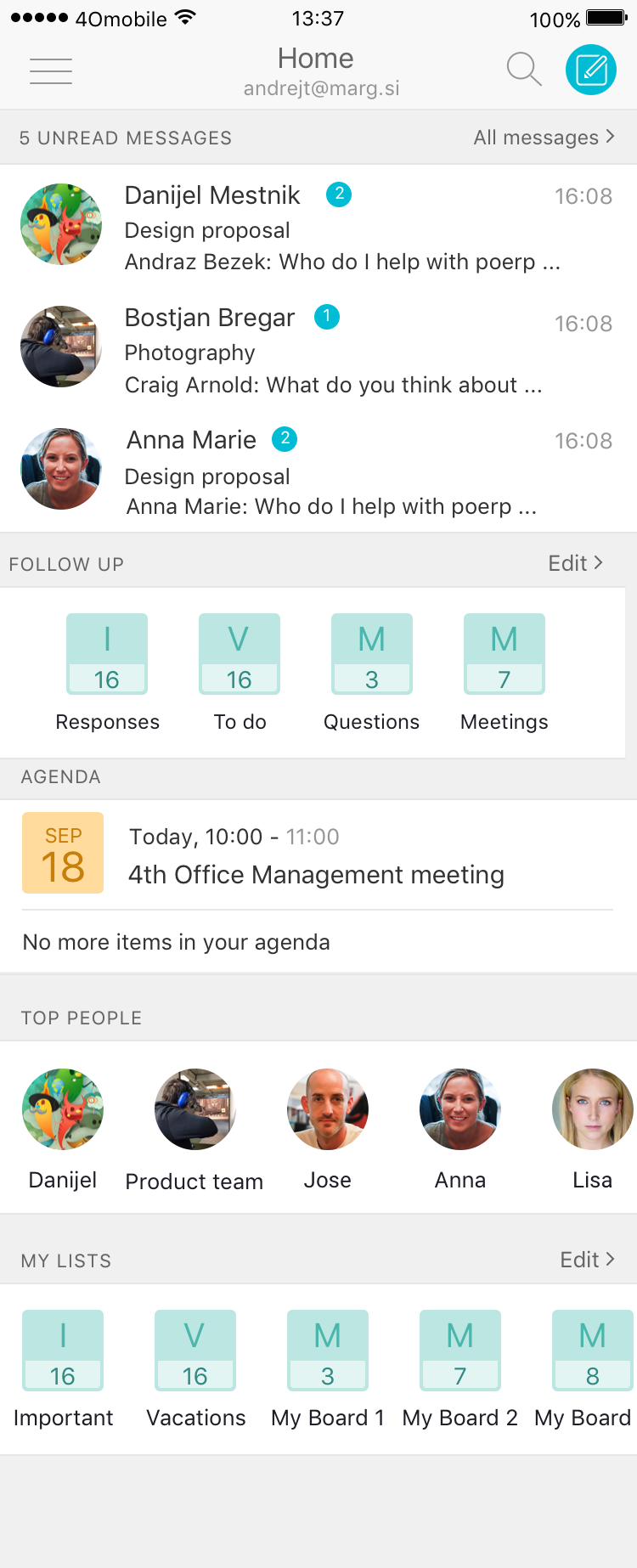
Following the first evaluation process I decided that to better understand the users, it was essential to run interviews with both current users and new potential users who are dealing with busy inbox on a daily basis. I started gathering the research insights and results and put them into an affinity maps, which shown some interesting trends. In particular:
People don't trust AI to do the job for themselves, they like to be in control. They may find the concept fun and interesting but they want to make sure everything is under control.
Writing and managing emails on mobile is still very frustrating for many users. People feel the need to have a cross device experience and manage their email from their laptop or computer.
Emails remain a 'formal' way of communicating in the majority of cases.

STAGE 2
Define
PERSONAS
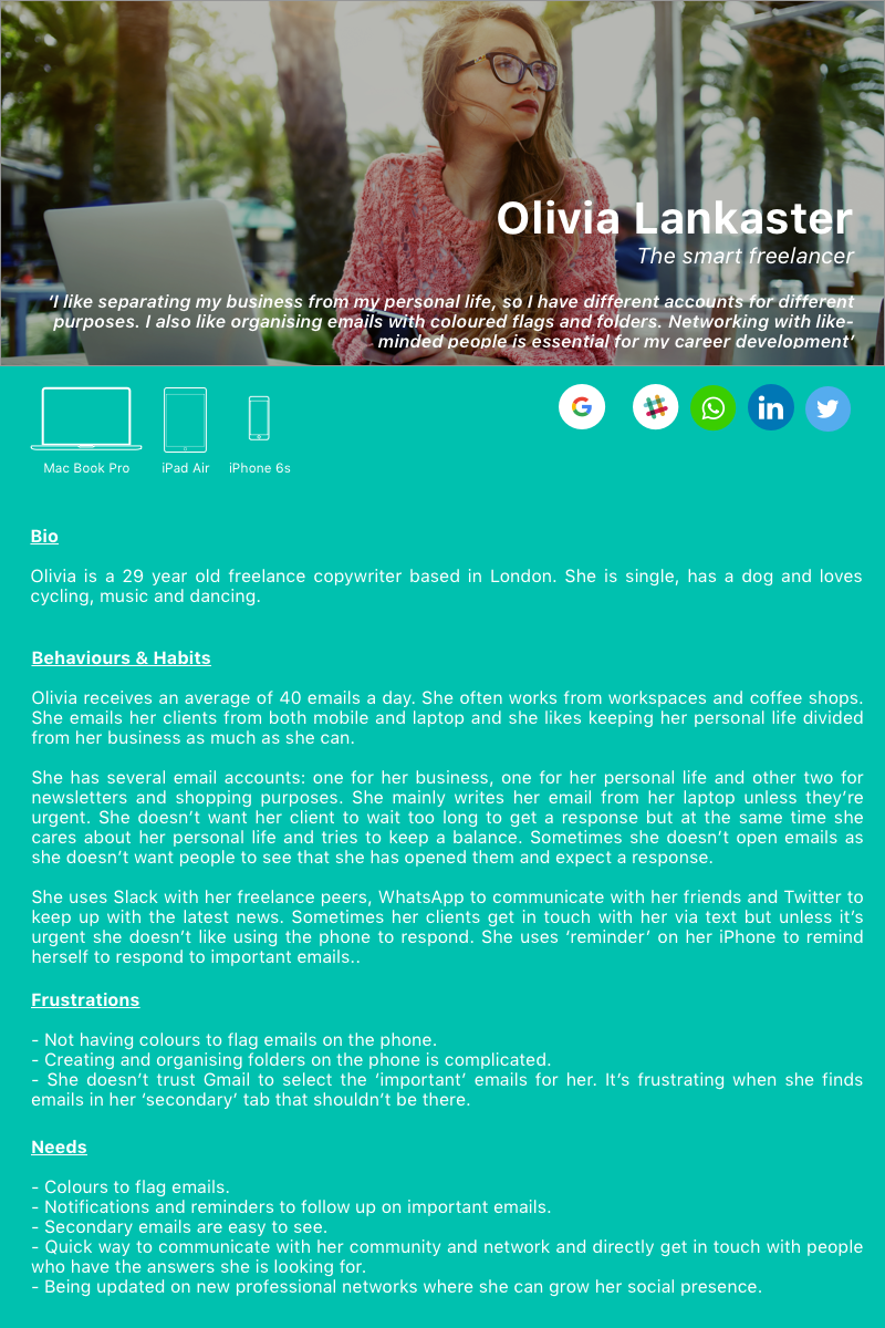
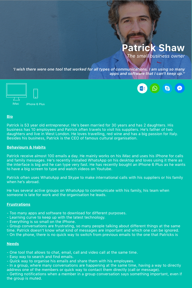
Working on the affinity map helped me define, step by step my final personas. It was interesting to see that the 3 personas that came up from the interviews brought clarity to the whole product and senior team.
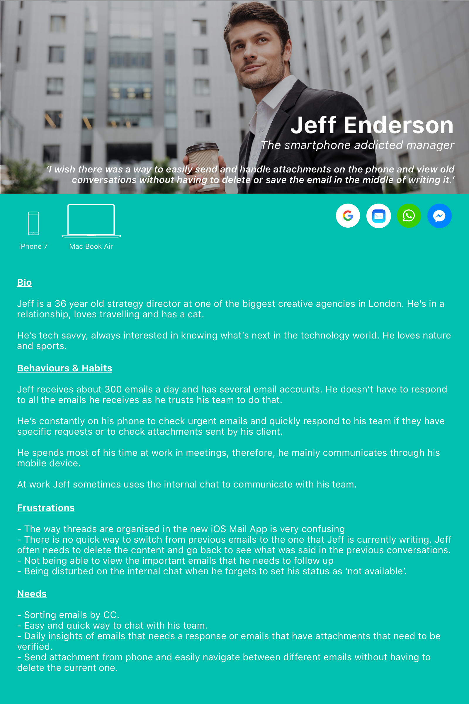
Primary persona: Jeff Enderson, 'The smartphone addicted manager'. Jeff mainly communicates through his phone but he doesn't really use this device to organise his emails and when at the end of the day, he realises that he might have missed some important emails he gets very frustrated.
Onboarding User Flow - Iteration 1

Working on the onboarding flow, I started exploring where the process could be enhanced and improve. One of the things that had been coming up in the 'discovery' phase is the fact that people were not willing to wait to long before landing on their home. To address that, we thought it would be good to have an option where users could choose 'how many days' should be uploaded by the App: the last 7 days, the last 1 or 3 months. Testing with users, we got some interesting insights:
Some users felt more empowered and in control of their own inbox and liked the features
Other started worrying about the app itself, enquiring about the safety of the app when choosing to share their app.
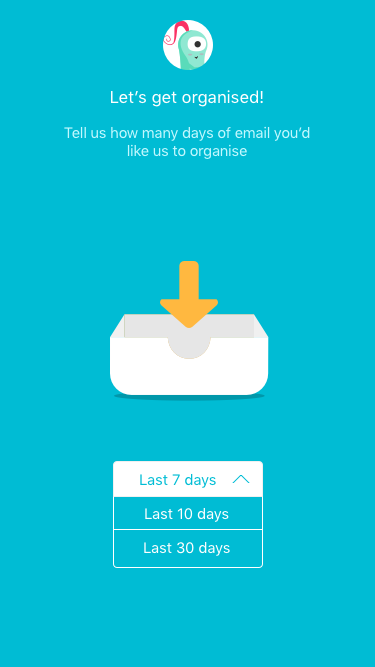
Together with the feedback from the users, the developers, with whom we were working, expressed their concerns around this feature because of the limited time they had available to build it. We then decided to not integrate the feature, but there was still something that needed to be done to enhance and make the experience more pleasant and helpful.

Onboarding User Flow - Iteration 2
We run another testing session to get users feedback, which in terms of onboarding, was surprisingly good. People seemed to understand the brand and the onboarding didn't have too many screens. However, when landing on the homepage, there was still that sense of 'confusion' and 'anxiety' of not understanding where emails were, what follows up where and what the different folders in the feature 'follow up' meant. This is when, we assumed that, by addingand extended onboarding to the app, users would had the opportunity to understand step by step what the app was about and how the different features were.